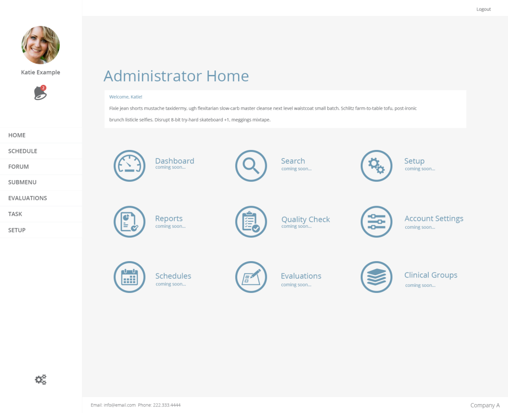
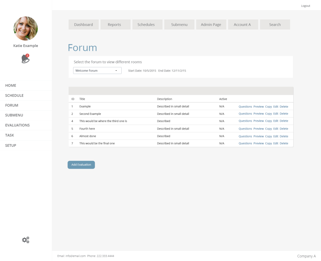
This week I focused on creating a simple and clean dashboard that can be applied to school or office setting. The goal of the dashboard is making the navigation feel new without taking away from the usability, and keeping the notifications in focus. To accomplish this, I created a navigation that rest on the left with a notification alert under the users photo.
You can see an example of the welcome page and a sub page below.
-Rick

