How many fonts should I use on my website?
Well, it depends.
As a general rule, you should probably stick with 2 or 3 fonts for your website.
Design
Generally speaking, using 2 or 3 fonts will ensure that your site has a consistent look and feel. Establishing a visual hierarchy for your users will be easier with less fonts.
Load Time
Like everything on your website, fonts must be loaded in order for a user to see them. Using too many fonts can actually slow down your website significantly.
Is 2 or 3 fonts enough?
We happen to think so. In fact, we believe that most of the time you can design a website using just one font.
The trick is to use variations of font weight, spacing, and line height to establish a clear visual hierarchy. The best part? Since its technically all the same font, your site is almost guaranteed to have a consistent look and feel. This consistency is great for brand recondition. We suggest that you actually use this rule across platforms and mediums to further establish your brand.
Where can I find fonts?
We suggest checking out Google Fonts .
They have a large variety of web fonts that load quickly and look great. You can also download the fonts you choose and use them for other mediums, such as print and presentations.
Oh, and did I mention that it’s free?
The One Font Challenge
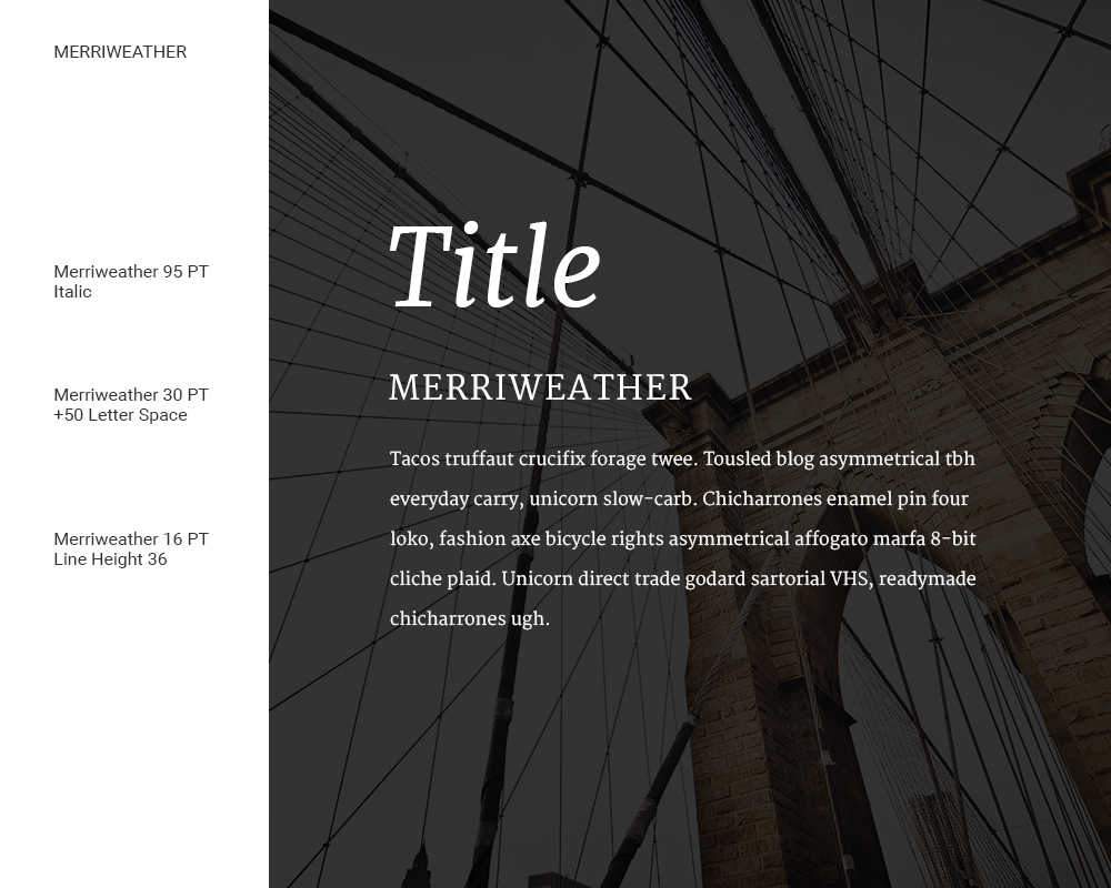
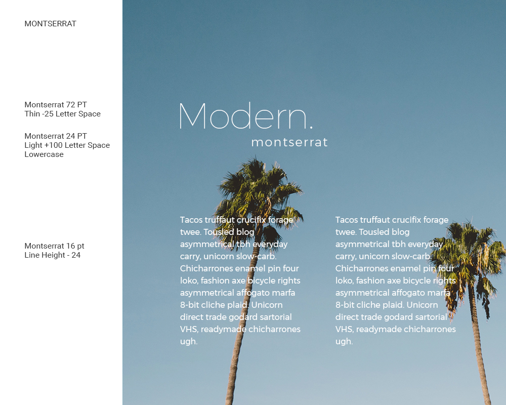
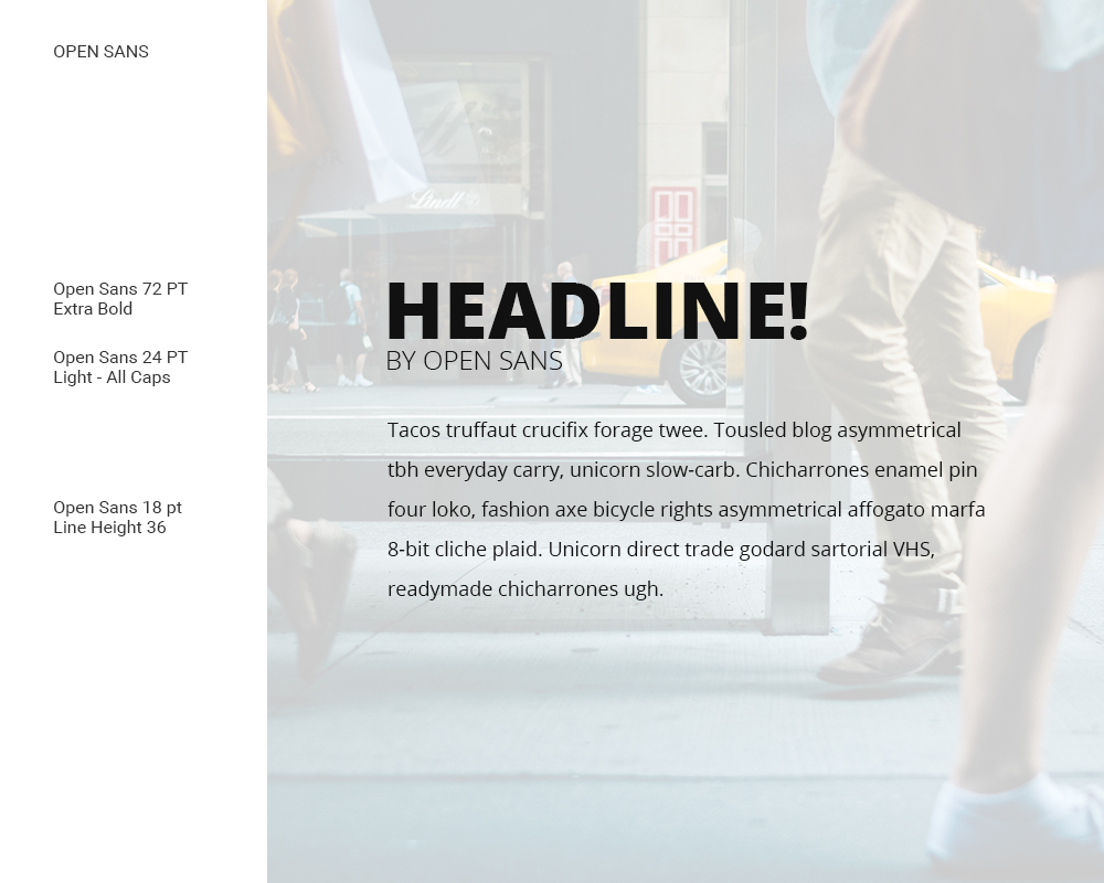
Using Google Fonts, we have created a few examples of using one font. By using different font sizes, weights, spacing and line height, we think we were able to establish a solid look for each of the three examples. We used some free images from Unsplash to help establish the tone for each example. Remember, all of these fonts can be downloaded for free using Google Fonts.


