When given the task of redesigning the logo for Jacket Software, I immediately did some research on the company, its current logo, and its goals.
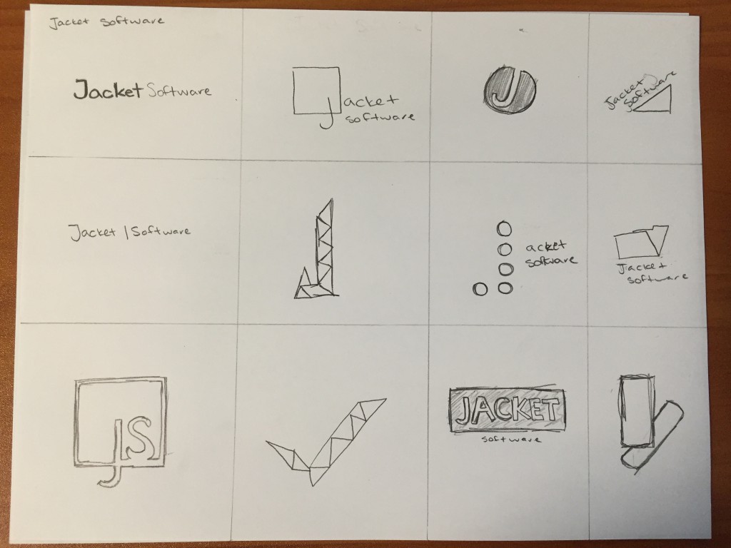
As always, I began my logo design process by sketching 10-20 different concepts. This is an invaluable step that is often overlooked by designers, but actually helped me land on my final design.

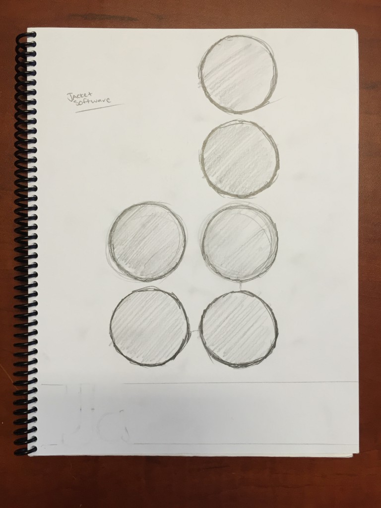
Originally, I wanted to incorporate a lot of clean edges to emphasize a more modern look. Through this process, I created a J out of triangles, and thought “what if I put this in a circle?”. While sketching, I thought why not make a J out of circles?

I then scanned the image to Adobe Illustrator and sketched out the circles digitally. I played around with a few fonts and layouts, and eventually landed on what ended up being close to the final logo.
I made a few adjustments after reviewing with the client and created a branding sheet specifying fonts, colors, and alternate uses for the logo. You can see the final logo design, as well as a few mock ups here.